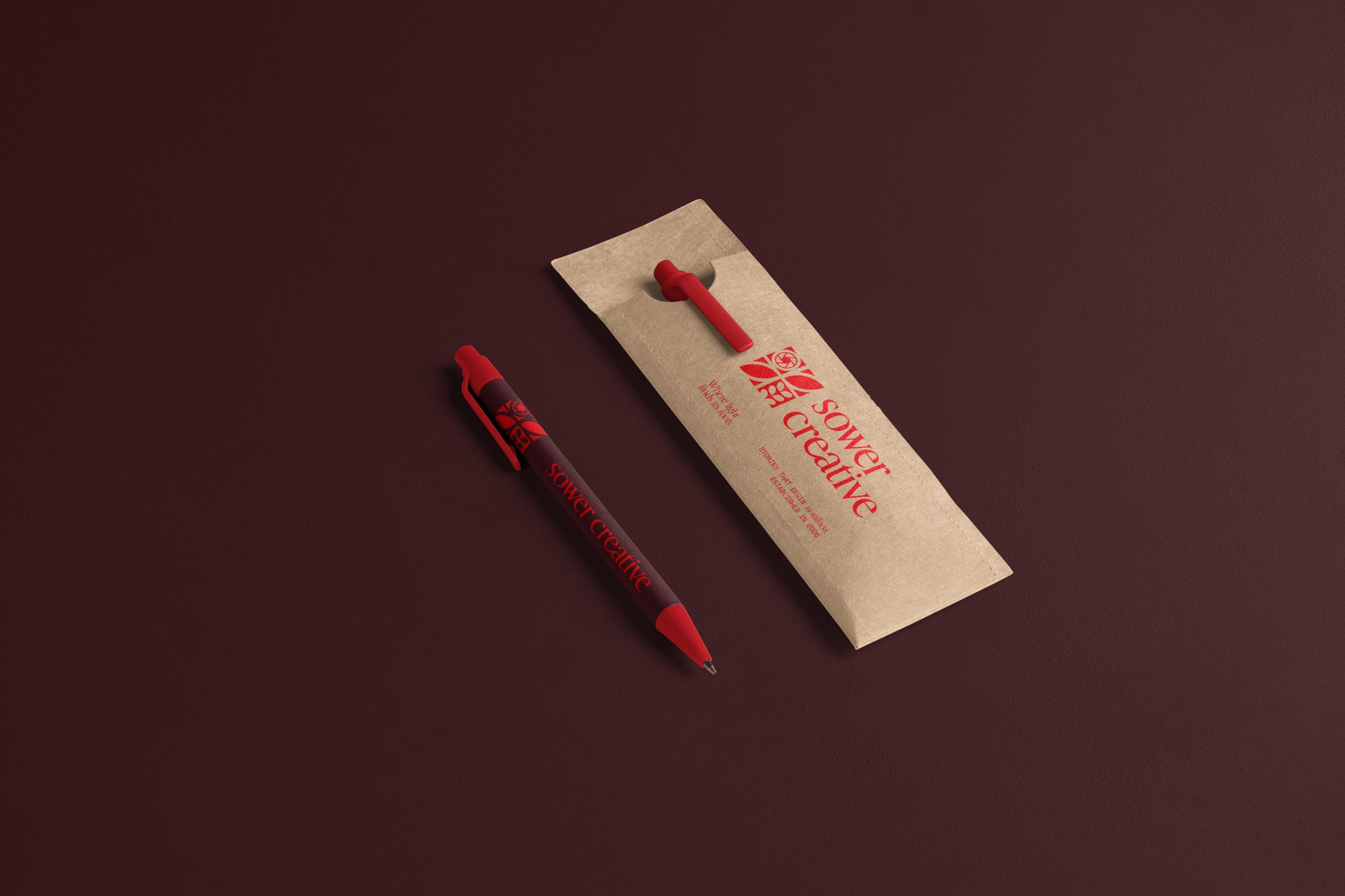

Sower Creative is a videography studio built around a simple idea: what you choose to focus on is what grows. Their work leans inspiring and uplifting rather than just polished — stories about where people plant their attention, their effort, their time, metaphorically sowing seeds that shape what comes next.
The mark leans directly into that idea. It's built as a four-part grid of leaves unfurling from a shared center, with a camera aperture worked into one of those leaves as if the lens itself were simply part of the plant — the act of shooting and the act of growing something treated as the same gesture. It's a literal handshake between the two halves of the name: sower and creative, planting and capturing.
The typography carries the same balance. A tall, classic serif keeps the wordmark feeling established and considered, while the supporting line — "Where light finds its roots." — keeps the tone warm, human, and approachable rather than corporate. Set against a confident red-on-cream palette (and its inverse), it reads as a studio that takes the craft seriously without losing the friendliness at the center of the brand.