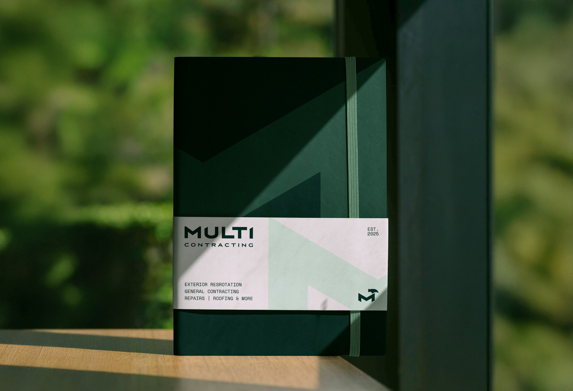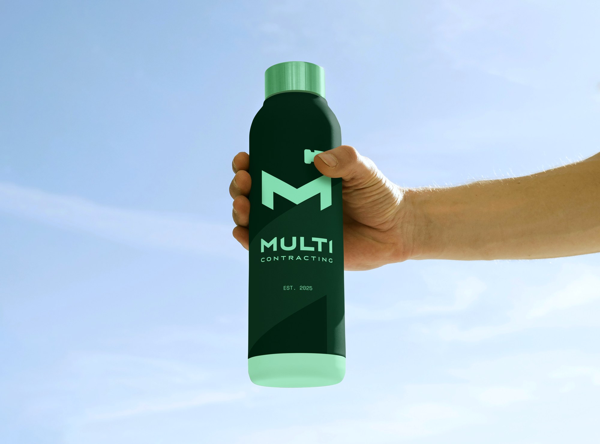
Multi Contracting is a general contracting company based out of Oregon, covering everything from exterior restoration and roofing to repairs and general contracting under one name. With that much range in services, the brand needed a mark that could carry the weight of "we do it all" — without actually trying to draw all of it.
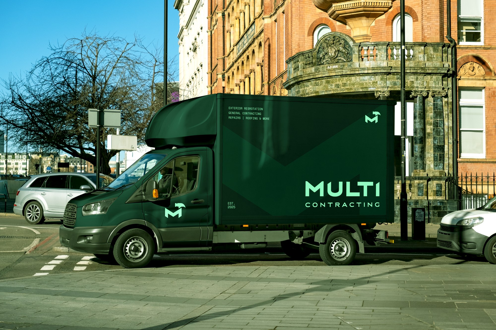
That was the problem with the original logo: it tried to cram a hammer, a saw, a wrench, a roller, and more into a single crest, attempting to visually account for every service the company offers. The result was a mark that got busy and lost legibility fast, especially at the sizes it actually needed to work at — a truck door, a hard hat, a business card. A logo that tries to paint the whole picture usually ends up saying less, not more.
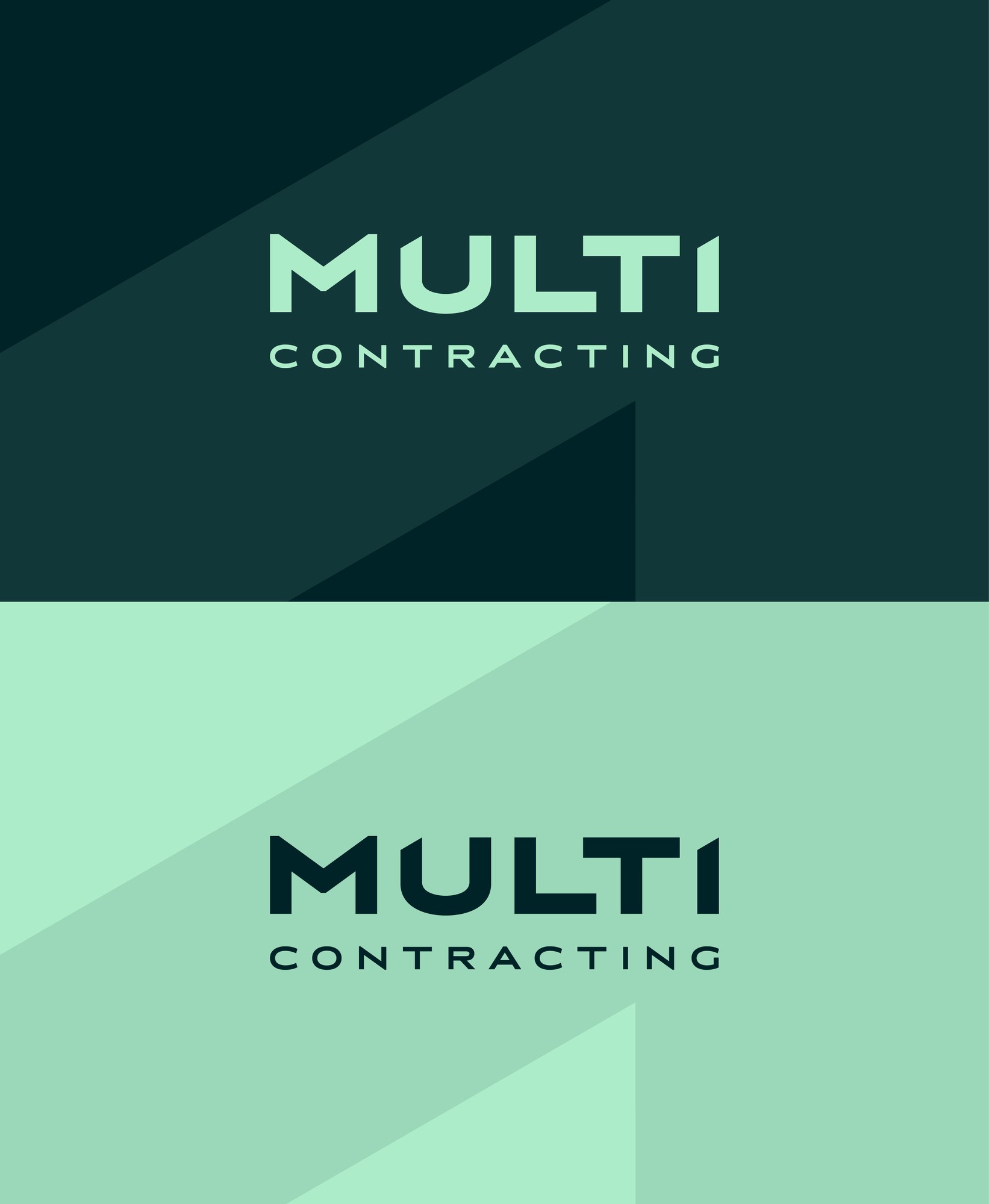
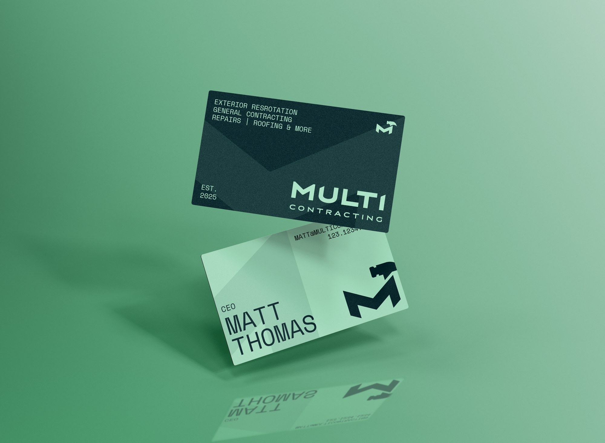
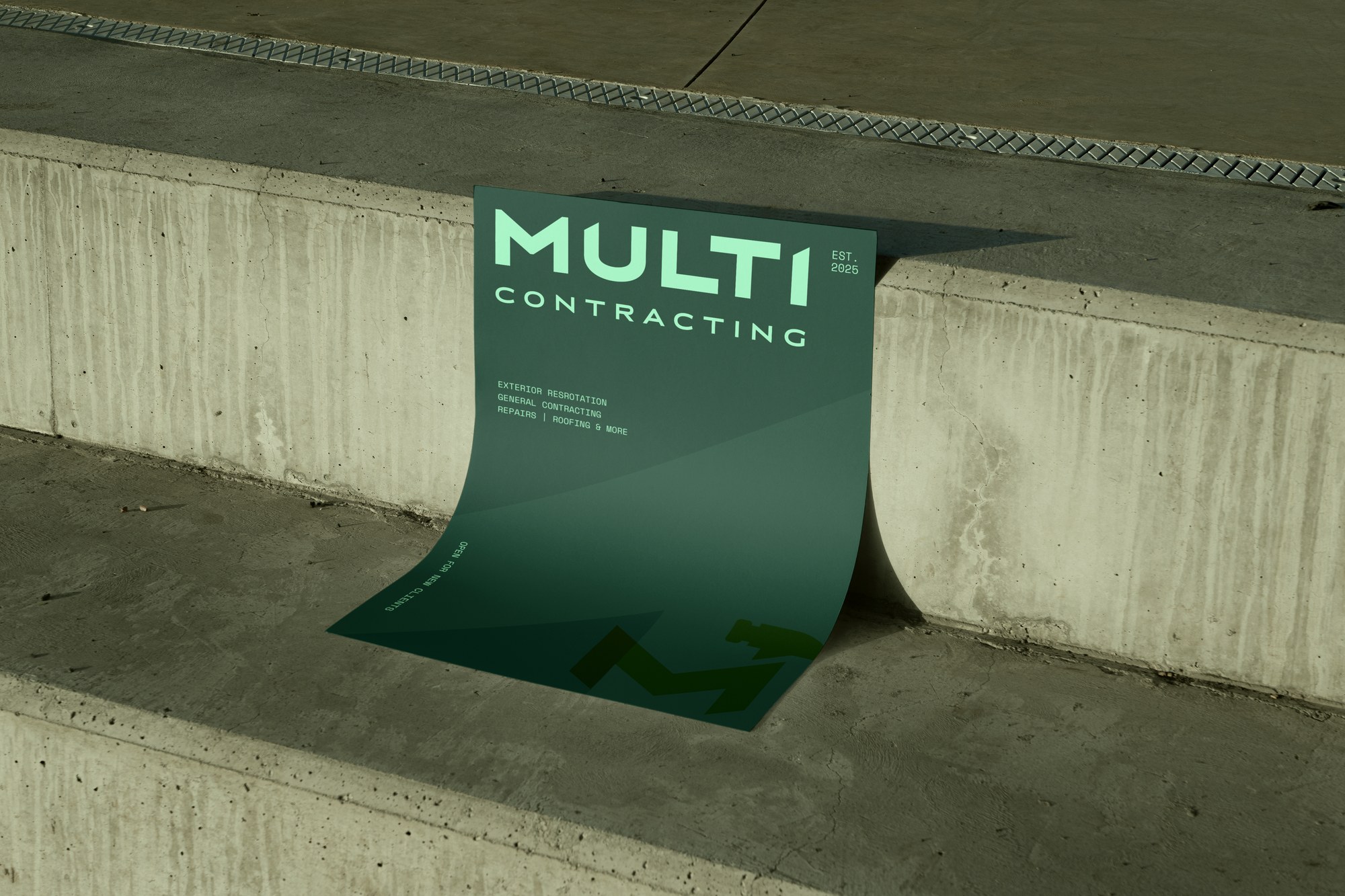
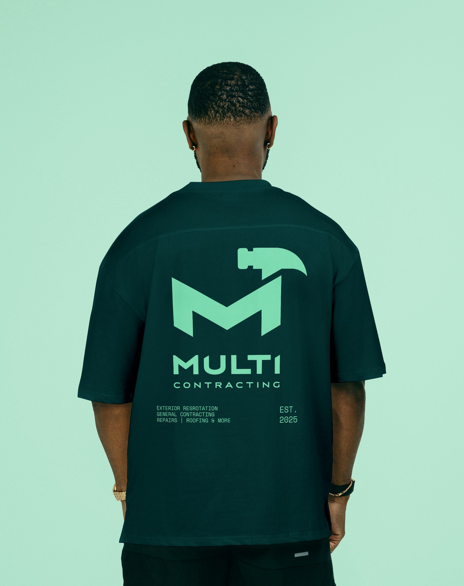
The rebrand pulls it back to one tool: the hammer, the one piece of equipment that shows up on every single job regardless of trade. Built into the negative space of a bold M, it carries the "multi" in the name without needing to spell out every service literally — a strong, clean mark reads faster and holds up better across every surface than one still trying to prove itself. The typography and deep green-and-mint palette are deliberately modern, which helps Multi Contracting stand out in a market still crowded with dated, clip-art-heavy contractor branding.